Use promo code Q1ESS25 at checkout. Terms Apply*
2025
DS World
Experience the future of connected dentistry: Each event showcases industry-leading education, cutting-edge advancements, renowned thought-leaders and unrivalled networking opportunities.
Featured
2023 Sustainability Report
Our sustainability strategy is fundamental to our mission and is integral to everything we do.

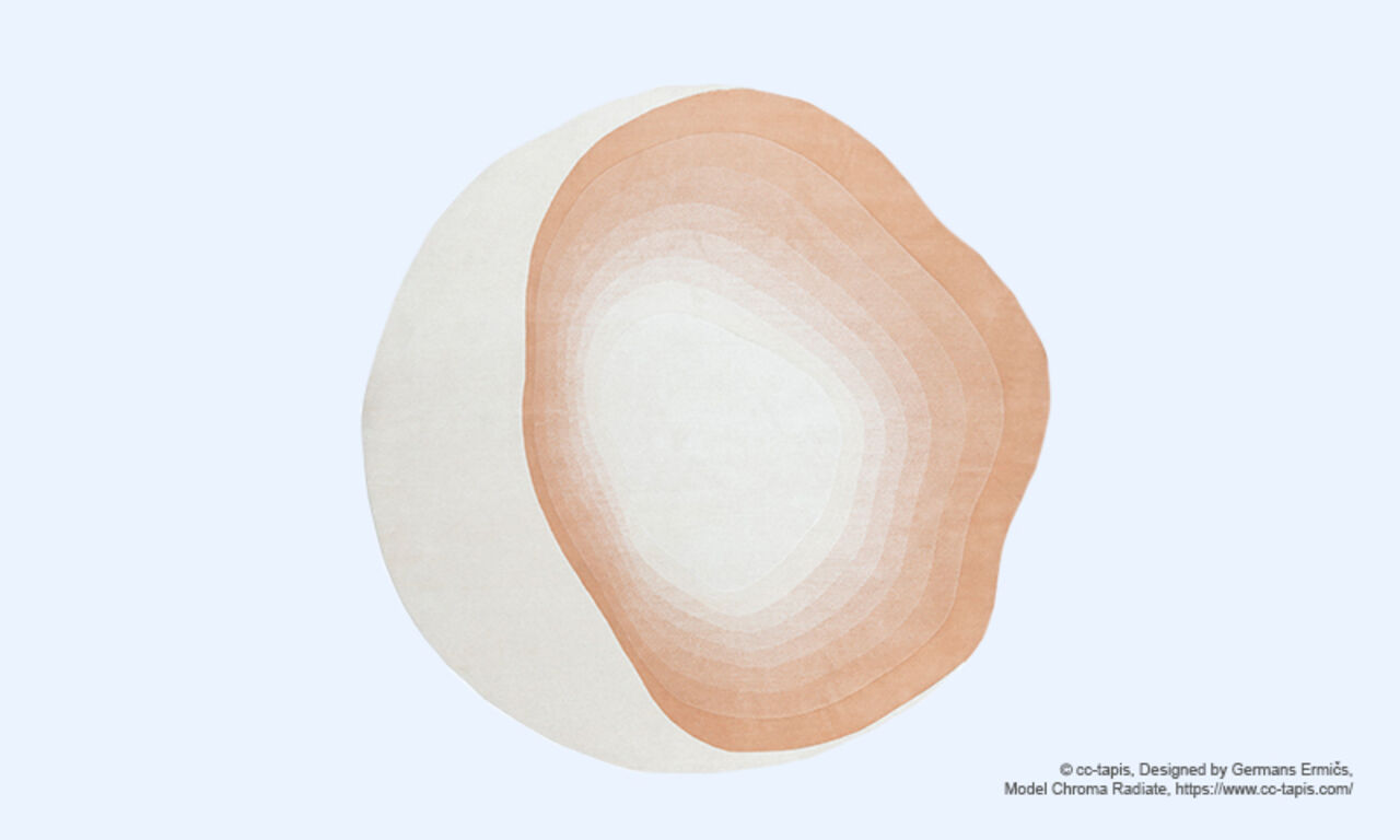
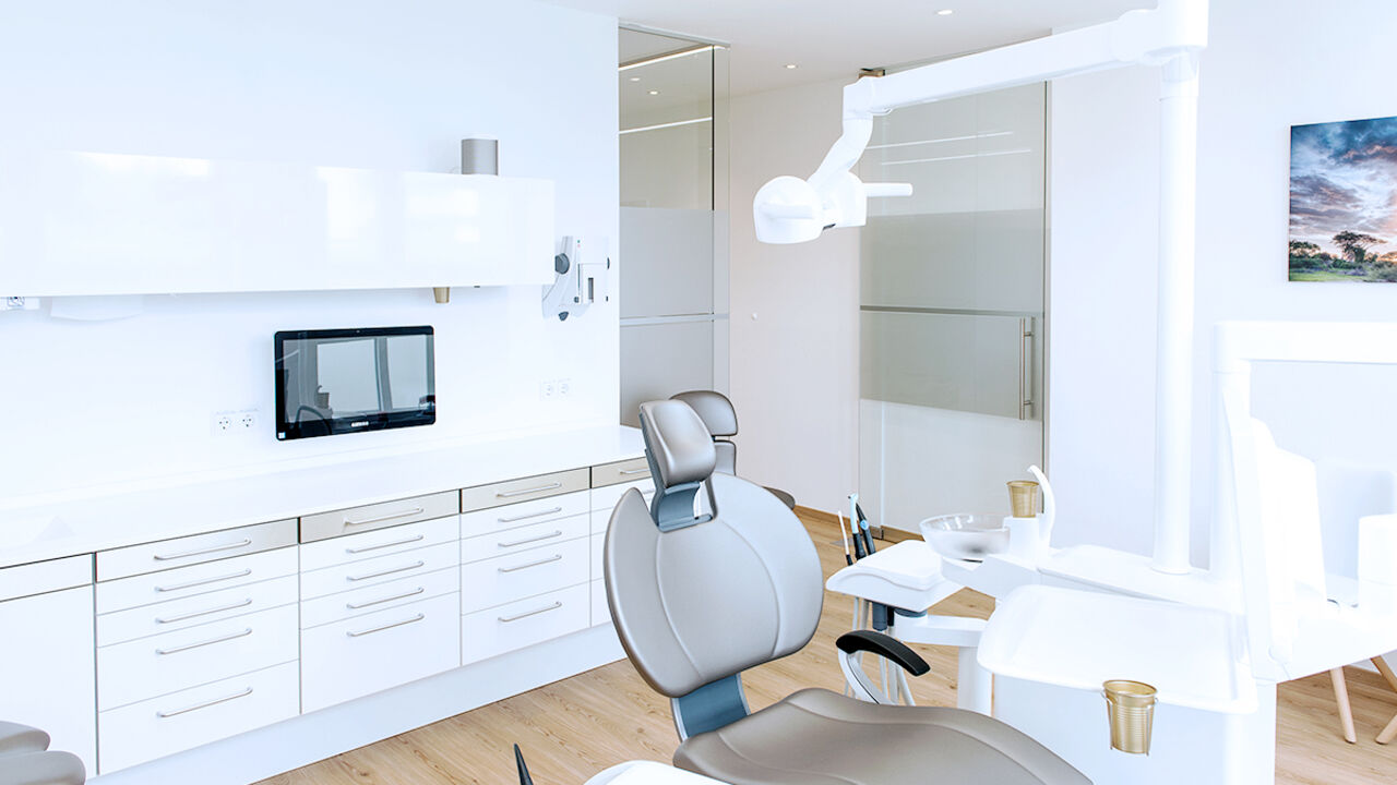
The Color Scheme
The colors selected are a soothing balance of warm, cool, and neutral tones. Mild pastels, such as Aqua and Rosé work with Neutral White and Platinum Silver to provide a soft, feminine touch. A distinctive Umber shade complements the lighter series as darker shade for contrast. The colors are often matt and soft but can also have gentle shimmering effects. All of these characteristics work together to create a graceful and calming atmosphere.

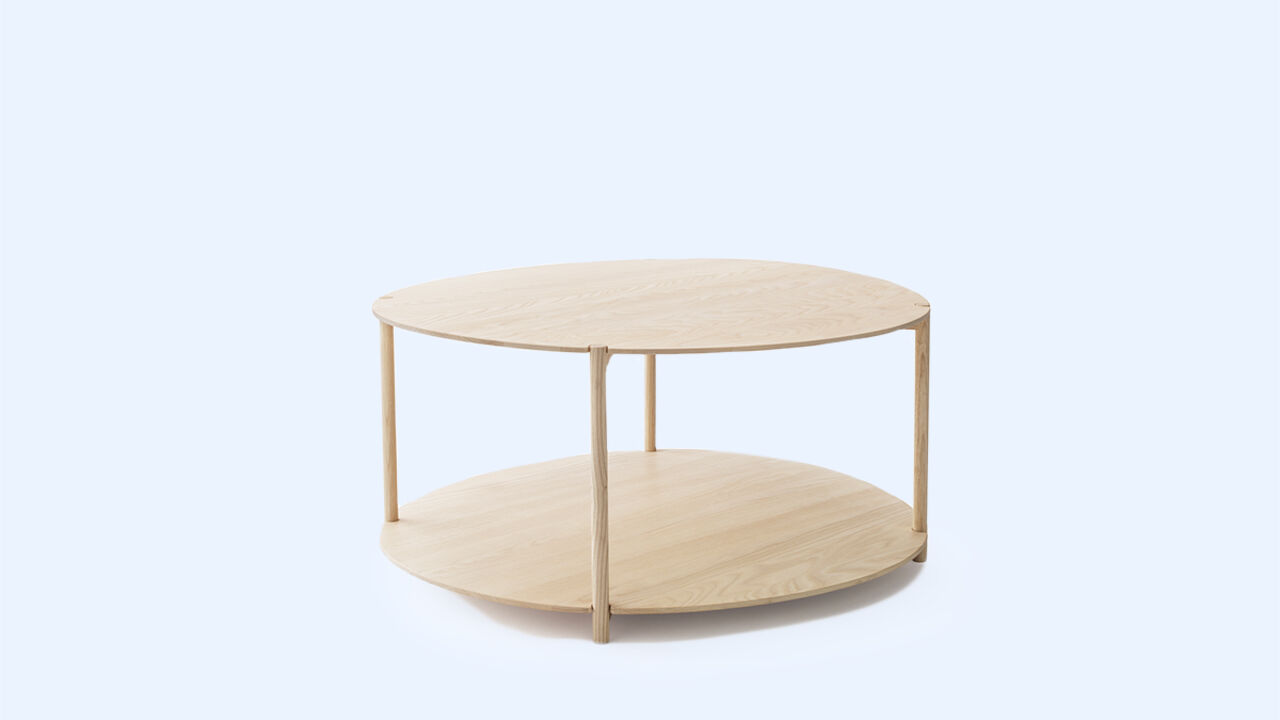
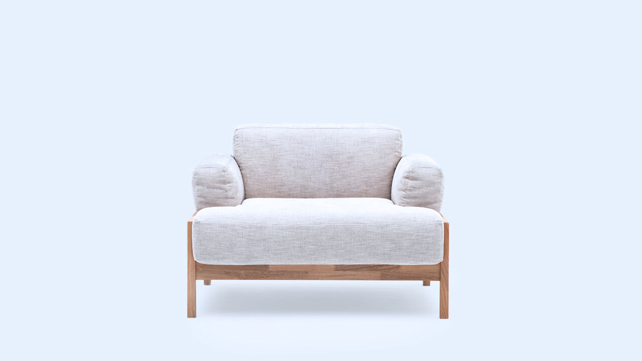
Materials & Furniture
Materials are chosen for their pleasant haptic qualities. The textiles and upholstery materials are soft and voluminous in order to create a cozy feeling. The woods used are often light, smooth, and can be lacquered in a matt finish. Furniture may be minimalist, based on round, soft shapes that offer a comfortable and relaxing seating position but can also be generous in their size and volume of the seating area, inviting a person to sit down and relax.

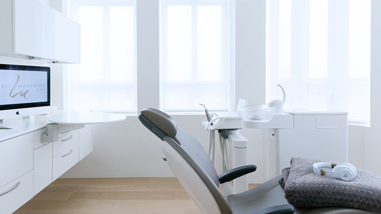
Calming Comfort in the Practice
In the dental practice, the design language of Calming Comfort helps patients to feel relaxed and in good hands. Everything from the color scheme, to the gentle shapes and volume of the furnishings, to the materials chosen for their haptic qualities are welcoming. Design can affect existing emotions that a patient has walking into the dental practice by either amplifying or reducing them. Stepping into a waiting room designed around the Calming Comfort theme means a respite from the stresses outside. Follow the links below to explore several real-world examples of dental practices that have beautifully incorporated the Calming Comfort theme into their designs.
Contact us
Find out more about Treatment Centers from Dentsply Sirona.
